HPI
A new brand and website for
a mature market leader

Client: HPI
Category: Self-funded health plans
Customers: Employers, employees, brokers
Locations: Massachusetts, Maine, South Carolina
Website: hpitpa.com
After 38 years as a regional leader, third-party administrator (TPA) Health Plans Inc. had aspirations to build a national profile. They turned to RainCastle for a comprehensive rebranding and visual identity solution.

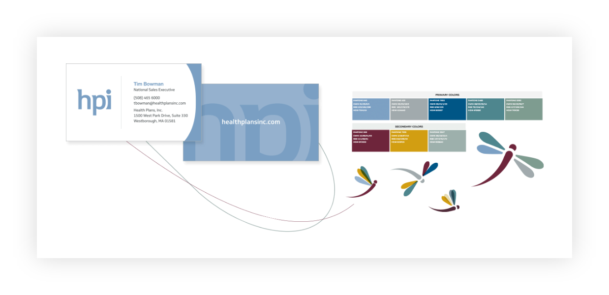
The client wanted to update their identity to be more modern and memorable. We proposed changing the company name to HPI and created a clean and contemporary logo.


Based on interviews with internal stakeholders and external audiences, we crafted clear and differentiated messaging highlighting HPI’s innovative approach to customized self-funded health plans.

To reinforce how HPI makes self-funding plans easy, we used simple, clean letterforms and a soft, friendly color palette. We augmented the logo with an illustration of a dragonfly, a symbol of wisdom and transformation, which the CEO felt represented her vision for the company.

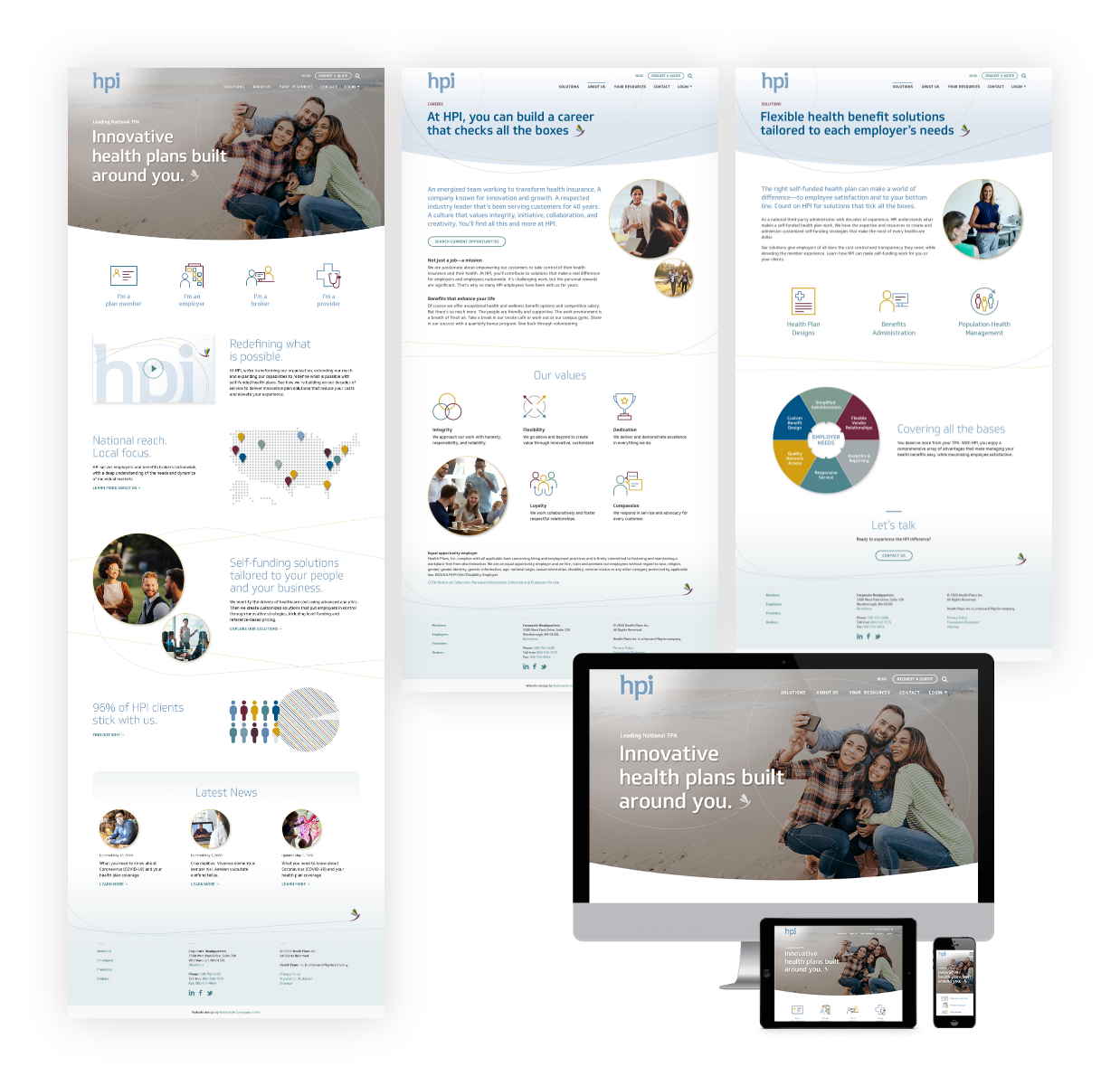
We streamlined the website information architecture to simplify navigation. Our design is clean and inviting, combining family-focused photography with concise copy and colorful graphics. Our development team produced the site on schedule, including integrating with the client’s password-protected customer portals.
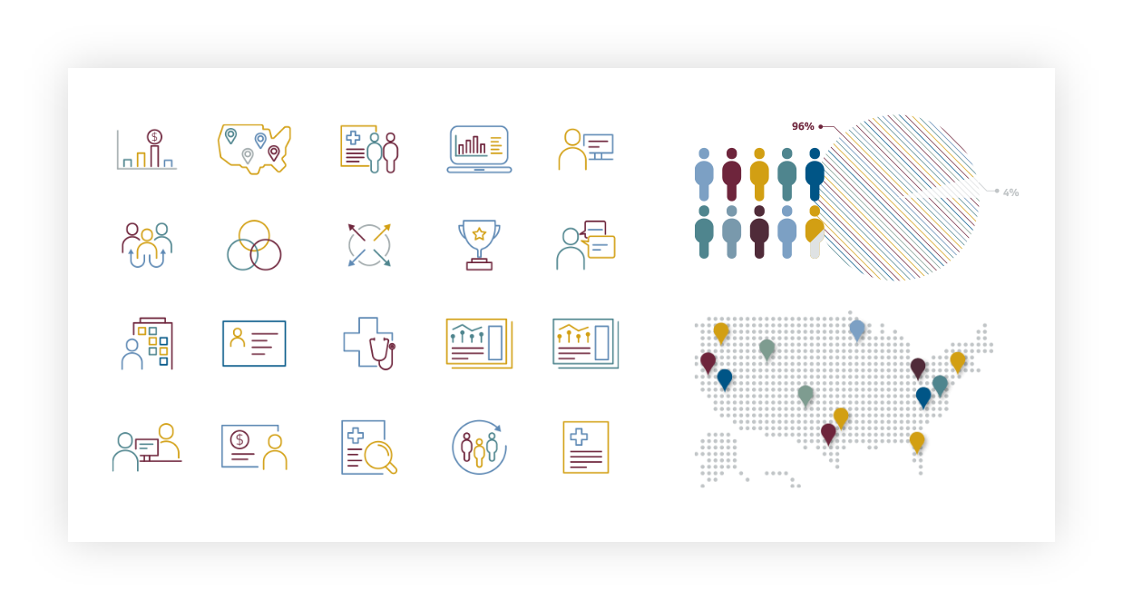
Our team designed a custom icon library and diagrams, creating a bespoke visual language that complements HPI’s new brand identity.
HPI pointed to RainCastle’s rebranding project as a critical step in their ambitious business strategy, infusing energy and enthusiasm throughout the company. Simultaneous to our work, the company moved to a new location, with the new HPI logo prominently displayed throughout the modern, open workspace. The company has since expanded into new regional markets nationwide.

© Copyright 2026
RainCastle Communications, LLC