Getting Started with Responsive Design
When it comes to the future of website design, smart devices (phones and tablets) are quickly becoming top factors in determining design approach. In order to be mobile or tablet optimized, you have a few options at your disposal:
1. A separate website optimized and designed for mobile
2. A responsive website design
3. App development
In October, we took you through five starter tips for mobile website design. These tips cover what to look at when designing a mobile-specific website as an accompanying piece to your current website. Most B2C and ecommerce companies are turning to this strategy because it allows you to condense mobile consumer behavior to a few key steps.
But what if you’re not interested in a separate mobile site? What if you want to maintain the content and design of your desktop website in a clean mobile version? This is where “Responsive Design” comes in (don’t worry, we’ll get to apps in a future post).
What is Responsive Design?
Responsive design is the process of developing your website so that the site can re-format and re-size itself according to the user’s screen resolution. For example, this allows you to design your website in a four-column layout for desktop resolution that will, once it senses a change in screen resolution, change its layout to accommodate the user.
This approach to design caters to tablet and mobile users: it centers on one design (normally, whatever you want to design for your standard website), and simply re-formats the existing content and design elements.
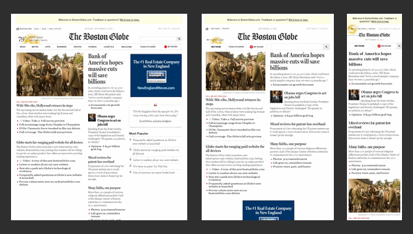
The Boston Globe, a staple in our neck of the woods, recently launched a new responsive website for subscribers with an ad campaign that won an EPpy Award. Originally a three-column layout, the site condenses to two, and then one, moving outer elements below the more important elements in the first column.

Photo courtesy of www.designmodo.com
Responsive design can also be used for email marketing, as RainCastle did for Tapestry Networks to announce the launch of their new website.

Because Tapestry works with many high-level executives who are often checking email on their phones, we designed a simple responsive email that would tailor to their needs.
What Does Responsive Design Depend On?
Responsive design hinges on three important elements:
1. Media queries
2. Flexible layout (fluid grids)
3. Flexible images
With all that responsive design offers in terms of accessibility, it also limits many of the options of a more traditional design. It may require you to choose different images and style elements, as well as page layouts and fluid grids that are more flexible. For instance, you may like the look of a semi-transparent logo behind your H1, but at a smaller resolution size it gets improperly cropped. This is just one style element that becomes a much larger issue when thought out in terms of responsive design.

do Lectures, an online community of forward-thinking lecturers, features video as their prominent feature, so using these elements is possible! Photo courtesy of www.inspirationfeed.com
Responsive design also gives large concentration to what content is most important when it comes to reducing what the user can see. Similar to how you think out what goes in a mobile-only version, with responsive design you need to consider what elements of the page stay on top, versus what content gets pushed down in lower screen resolutions.
Additionally, calculating all of these elements perfectly in proper CSS style so that the site is ultimately responsive makes for an exceptionally complex site in terms of coding, and could limit your ability to make incremental design changes.
Are You Saying That Responsive Design is Not Worth the Hassle?
Absolutely not! Responsive design requires detailed planning and coding, but when done correctly allows for your website to look its best across all platforms. Mobile and tablet visits are only growing, and it’s never too early to consider ways to adapt to these users.
What responsive websites have you seen used effectively? Have you considered re-designing your website to incorporate responsive design?
