5 Reasons Why Most Websites Look the Same Today
Just last year we won a terrific job by showing the client 10 competitor sites, which all looked almost exactly like theirs. The need for differentiation was alive and well.
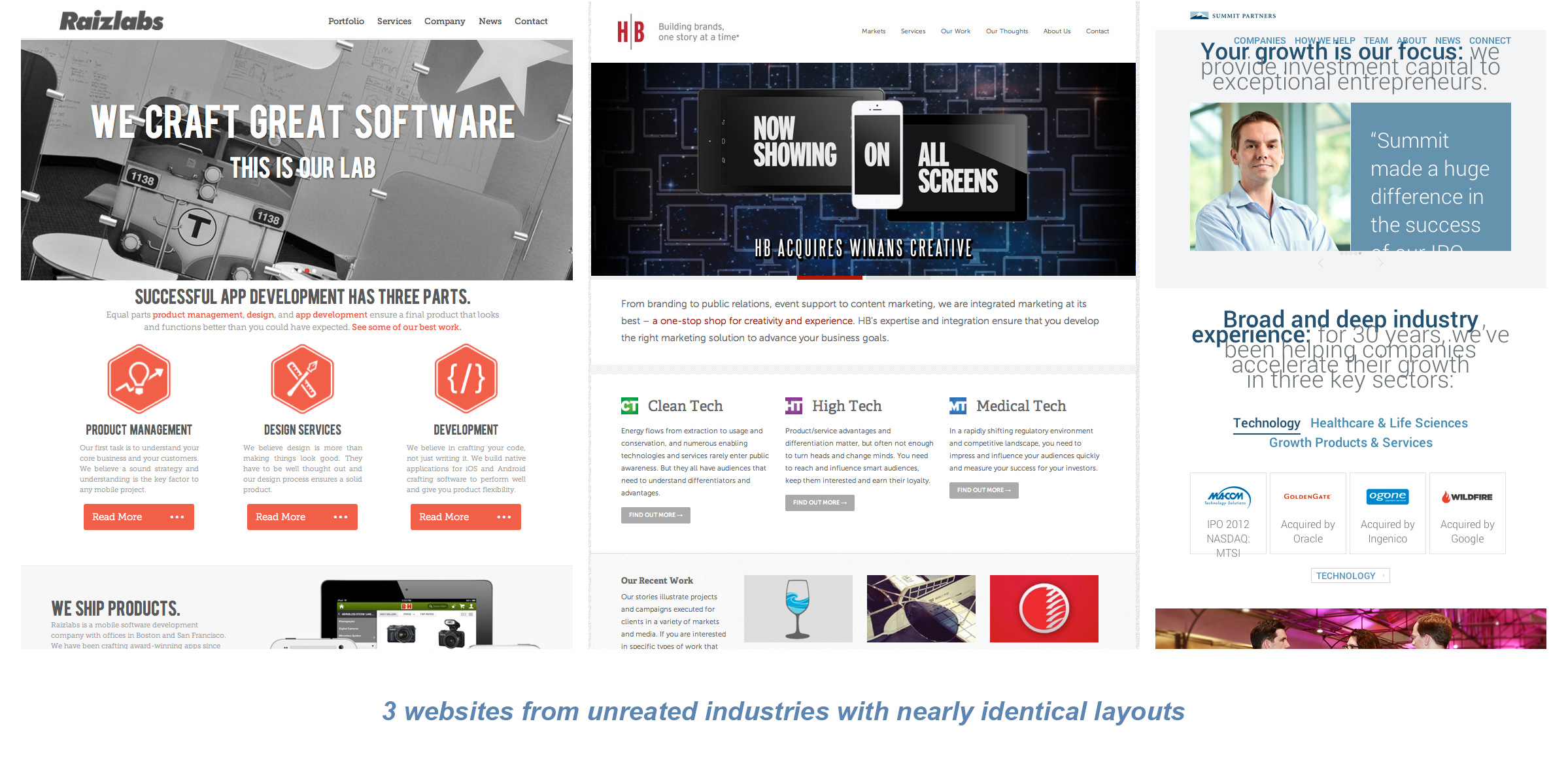
 I did a double take the other day when I happened on the website of a venture capital firm. It was a perfectly nice website, but I was taken aback by how identical it was to the site of a consulting firm or a high tech firm. In fact if the logos were removed, you might be hard pressed to guess what kind of business you are viewing. Homogenization is good… if you’re a container of milk, not so good if you’re trying to market.
What’s behind the “Me too” movement?
There are five causes I can see for why websites have become much more simple, modular, prone to large type and created as a series of long, scrolling pages.
Mobility
Technology is defining design by “mobilizing the desktop.” The new standard for websites is “Responsive Design,” which describes a way of designing and programing, which allows the website to detect the viewer’s device and reconfigure itself accordingly. Designers have discovered that simplifying the design by removing complex image/type overlays, using small type, modular units of bold color, and scrolling navigation, makes the design process easier and the user experience less problemmatical.
Google
Last year, Google changed their Search algorithm, making it much harder for businesses to track which keywords bring the visitor to their site. The density of website content had been somewhat a product of including as many keywords into the copy as possible such that Google would deem the site relevant and award a higher page ranking. Now that Google has changed their definition of what “relevancy” means, to something attempting to be more authentic, businesses have lightened the content load by simplifying the quality and quantity of their language.
ADHD
It’s a well-known fact that people are less able to focus on anything without multiple beeps, rings and interruptions, and are generally stretched so thin that reading a long web page of tightly spaced text was not high on the list of priorities. Some of our new clients had also been seeing steady dips in site traffic and felt that a more simple approach was an idea whose time had come.
B2C
In our B2B world, we always look toward B2C to see what trends will make their way to the world of professional services and technology marketing. Bold colors, big shapes, icons instead of words, pictures in place of paragraphs and infinity scrolling are what was happening in consumer websites over the last two years and is now the defacto standard of the B2B website.
Storytelling
The word “engagement” has become very important to businesses that are trying to cut through the noise and make a connection with their prospects and customers. Guiding a site visitor down a simple set of screens that gradually and simply tell a nice, clear, simple story with muliiple calls-to-action along the way is a more engaging way to generate leads and connect with people.
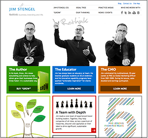
 These 5 reasons explain the homogeneity of websites but don’t entirely excuse it. Online brands still need to express themselves in compelling and unique ways, while adhering to best practices. B2B buyers are still people, and people react from emotion, as well as for rational business reasons. A recent site RainCastle did for former Procter and Gamble CMO, Jim Stengel, is a case in point, a hybrid of longstanding website best practices of clean design, deep content and ease-of-use with the new paradigm of modular calls-to-action and scrolling page content. It is also responsive, optimized for search and lead generation, and visually interesting, and not a copycat site. I think it is a fair expectation for clients to expect that as designers, we will create site experiences that aren’t easily replicated by the masses.
I’d love to hear from you about other excellent new websites that exhibit best practices but do so in unique ways.
